Case · 01 · concept build
Forge Barbershop
A vintage editorial site for a fictional Shiregreen barbershop, built end-to-end as a spec piece. This is the working file.
- Type
- Concept build (no real client)
- Sector
- Barbershop
- Pages
- One, hand-built static HTML
- Build time
- About 3 days
- Stack
- HTML, CSS, vanilla JS
- Hosting cost
- £0 / month on Cloudflare Pages
/ 01 The brief I gave myself
What does a Sheffield barbershop site look like when it isn’t a Wix template?
Every barber site I looked at on Chesterfield Road and Firth Park was the same template. White background. Stock photo of a fade. A “Book Now” button that opens a Facebook page. Phone number in a tiny font at the bottom.
The brief I set was simple: build a one-page site for a fictional Shiregreen barbershop, called Forge, that would feel like the chair you sit in. Worn leather, brass fittings, warm light. It should also do the practical job: show prices, take a booking, prove the shop is real.
Constraint: no agency budget. The whole thing should be deliverable inside the £750 Standard tier.
/ 02 The design decisions
Three calls that shaped the rest.
1. Editorial layout, not landing-page layout
Most small-business sites copy the SaaS landing-page format: hero, three-column features, testimonial slider, CTA. Forge ignores that entirely. The structure reads like a printed broadsheet: stamp date, masthead rule, an opening lede in italic serif, then the sections drop in like columns of a magazine. The page feels like it was set, not generated.
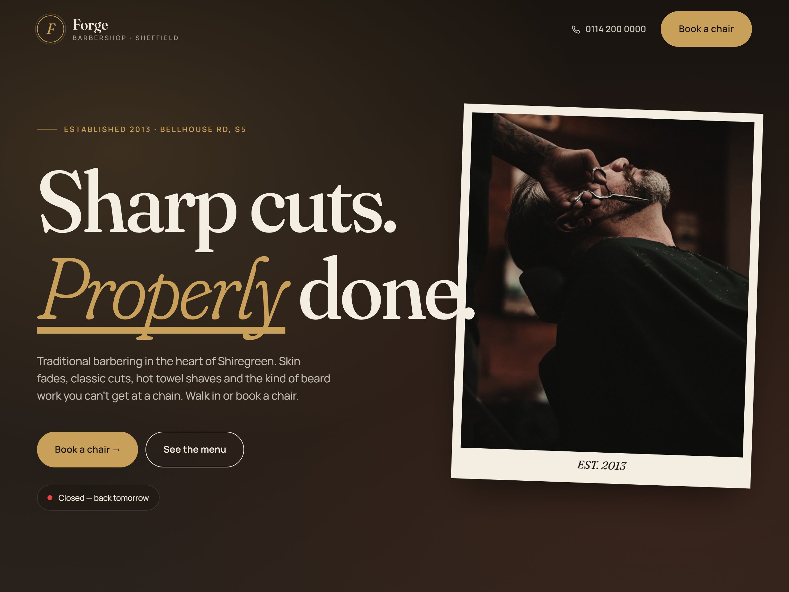
2. A photo-print hero, not a stock photo
The hero image gets a faint duotone treatment and sits inside a thin red rule with a typewritten caption. It looks like a darkroom print pinned to a wall, not a homepage. This single detail does most of the work in establishing “this shop has taste” before the visitor reads a single word.
3. Dark, warm palette. Fraunces serif throughout.
Charcoal #1a1410 background, brass #c9a05a accents, paper-cream type. Fraunces (a high-contrast contemporary serif with optical sizes) carries every headline and price. No system sans anywhere except the small mono-spaced labels. The result feels like a pub sign carved by someone who cared.
/ 03 The booking flow
Three steps. No JavaScript framework. Works on a five-year-old phone.
The booking modal is the most-built thing on the page. It’s a three-step flow:
- Step 1. Pick a service (cut, fade, beard, hot-towel shave). Each option shows price and duration.
- Step 2. Pick a barber and a slot. Slots come from a small JSON object, easy to swap for a Fresha or Booksy embed in production.
- Step 3. Name, phone, confirm. The submit handler pre-fills a WhatsApp message to the shop with all the booking details, so the shop owner gets a normal WhatsApp ping with the order ready to confirm.
Total weight: about 4KB of JavaScript. No React, no Next, no booking-platform fees. The flow is replaced by a real Fresha or Booksy embed in a moment if the shop already runs one; the whole purpose was to prove the front-end could carry the visual experience without a heavy backend behind it.
The site sits in front of your booking system. It’s the shop window. The button drops them into Fresha or Booksy, or pings you on WhatsApp.
/ 04 Build notes
Things you only notice when you look closely.
- Mobile-first, but tested on a real phone. The whole site was built and reviewed on an actual mid-range Android, not a Chrome devtools simulator. Touch targets sit at 44px minimum. The booking modal’s buttons are reachable with a thumb at the bottom of the screen, not the top.
- Loads in under a second. No build step, no framework runtime, no analytics, no font loader script. Fonts come from Google Fonts with
display=swapand the page paints with system fonts before they arrive. - Every image is local. Seven photos, all hosted with the site, all named semantically (
hero-interior.jpg,gallery-hot-towel.jpg). No third-party CDN that might 404 a year from now. - No cookies, no tracking. The site sets zero cookies. No analytics, no Facebook pixel, no consent banner needed. UK GDPR-clean by default.
- Accessibility. Landmark roles, alt text on every image, focus rings preserved, contrast ratios checked. The booking modal traps focus and closes on Escape.
/ 05 What this build proves
It shows what a £750 site looks like when nobody’s phoning it in.
Forge is fictional. There is no Bellhouse Road barber called Forge. The address, the founder bio, the testimonials are all illustrative. What it demonstrates is real:
- A Sheffield small business can have a site that looks like it cost £3,000 without paying £3,000.
- A booking flow can sit on a static site without WordPress, plugins or monthly platform fees.
- The whole page can load in under a second on a 4G phone in a barber’s shop with three bars of signal.
- None of this requires a content management system the owner has to learn. Updates come through a WhatsApp message.
If you run a barbershop in S5, S9, or anywhere else in north Sheffield, this is what your shop window could look like online. Different photos, different palette, different name; same level of finish.
Want one for your shop?
Founding-3 pricing is open. Two of three spots remaining for May–June 2026. Drop a WhatsApp or an email, no form, no spam.